 |
| HTML and CSS tutorial for beginners in English |
Hello friends, welcome to KTL's HTML and CSS tutorial. Today we will study lesson 23.
In our previous lesson we have studied CSS selectors.Today we will study about CSS measurements.
Measurements in CSS
We need to mention measurements to display elements in a web page. Let us take consider some examples. If we need to display an image in a web page then we need to mention its width and height. Similarly we can mention size of our text that is to be displayed. We can specify margin of an element. We can also define width of a border. In all such cases we need to give measurements. We know some units of measurements for length like centimeter - cm, millimeter - mm, meter, kilometer and so on. Of course, we can use cm and/or mm in HTML.
It is important to note that when we mention some measurement in HTML, we should not give space between actual measurement and its unit. For example, margin of an element should be written as 2cm.
There are two types of units of measurement. 1. Absolute measurement and 2. Relative measurement. We will learn about these today.
Absolute measurements
It is important to note that absolute measurements are fixed. Therefore, they do not adjust according to the size of screen. Relative measurements are comparative, hence they adjust as per size of screen. Therefore, considering different sizes of screen like mobiles, computer screens, or televisions, always relative measurements are recommended. In designing our web pages we should make sure to use relative units of measurements.
Absolute units are as follows:
1. cm - centimeter
2. mm - millimeter
3. in - inches
4. px - pixels (96 pixles = 1 inch)
5. pt - point (72 points = 1 inch)
6. pc - pica (1 pica = 12 points)
Now we will write a script using absolute units. Open a new Notepad file. Copy code of lesson-22-1 in this file. Delete everything under <style> and write the following:
<style>
Now we will write a script using absolute units. Open a new Notepad file. Copy code of lesson-22-1 in this file. Delete everything under <style> and write the following:
<style>
h1 {
font-size: 1;
}
p {
font-size: 0.5cm;
}
</style>
 |
| Figure 23-1. CSS Absolute measurements |
Double click on HTML document and see the output.
 |
| Figure 23-2 Output of CSS measurements in absolute units |
Heading and paragraphs are displayed in the font size that we have given. Now let us use pixels. You can change dimensions to h1 30px and paragraphs 15px. Again save this file as "Lesson-23-1" and "Lesson-23-1.html" and see the output. Note how font size is changed.
Now let us study relative units of measurements. They are as follows.
1. em - relative to measurement of current element. For example 5em means 5 times the measurement of current element.
1. em - relative to measurement of current element. For example 5em means 5 times the measurement of current element.
2. vw - 1% of width of browser window. Browser window is call viewport. Therefore, the name vw is used - v = viewport, w = width. If we mention 10vw then it is 10 times 1% of viewport width.
3. vh - 1% of viewportheight.
4. vmin - 1% of smaller size of viewport.
5. vmax - 1% of bigger size of viewport.
6. % - This is percentage compared to size of parent element.
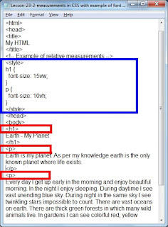
Now let us make use of relative units in our script. Open a new Notepad file. Copy all code from lesson-23-1 in this file. Delete the code under style and insert the following code.
h1 {
Now let us make use of relative units in our script. Open a new Notepad file. Copy all code from lesson-23-1 in this file. Delete the code under style and insert the following code.
h1 {
font-size: 15vw;
}
p {
font-size: 10vh;
}
Save this file as "Lesson-23-2" and "Lesson-23-2.html".
 |
| Figure 23-3. CSS relative units of measurement |
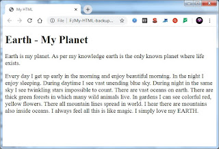
Click on the above figure for PDF file of source code. Double click on HTML document. See the output.
 |
| Figure 23-4 Output of measurements in relative units |
Once again text is displayed in the measurements that we have mentioned.
Now very important point: Display output of lesson-23-1 and output of lesson-23-2. These are displayed in two different tabs of browser or two different windows of browser. Go to the output of lesson-23-1. Go on reducing the size of browser. Text size will remain the same. It will not change. Go in the output of lesson-23-2 and again go on reducing the size of browser. Text size will get adjusted according to the size of browser size. This is a very important point to note. Elements for which dimensions are given in absolute units of measurement do not adjust according to the size of screen, where as elements for which dimensions are given in relative measurements do adjust. Therefore, always use relative units of measurements.
Important Points:
1. There are two types of units of measurements namely absolute and relative.
2. Elements with dimensions in relative units are flexible. They adjust according to the screen size. Therefore, always use relative units of measurements.